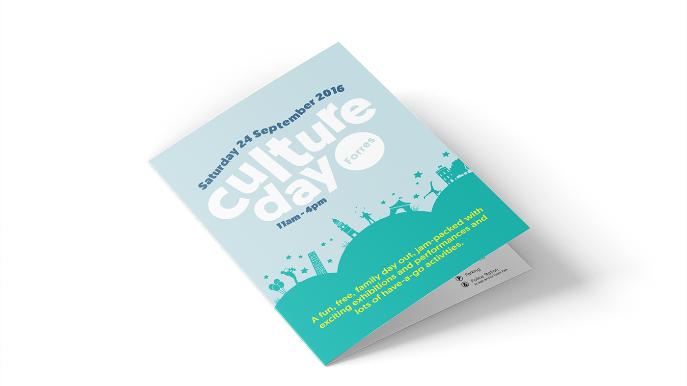
A vivid, high-key colour palette with simple, clear typography provided a youthful look and feel without creating unecessary visual distraction.
Animated filters help users navigate the site content.
Multiple Filters and options enable young people to find the opportunities and resources that are right for them.
In page animation keeps the user in context and enables a simple site navigation.
View the full site at:
